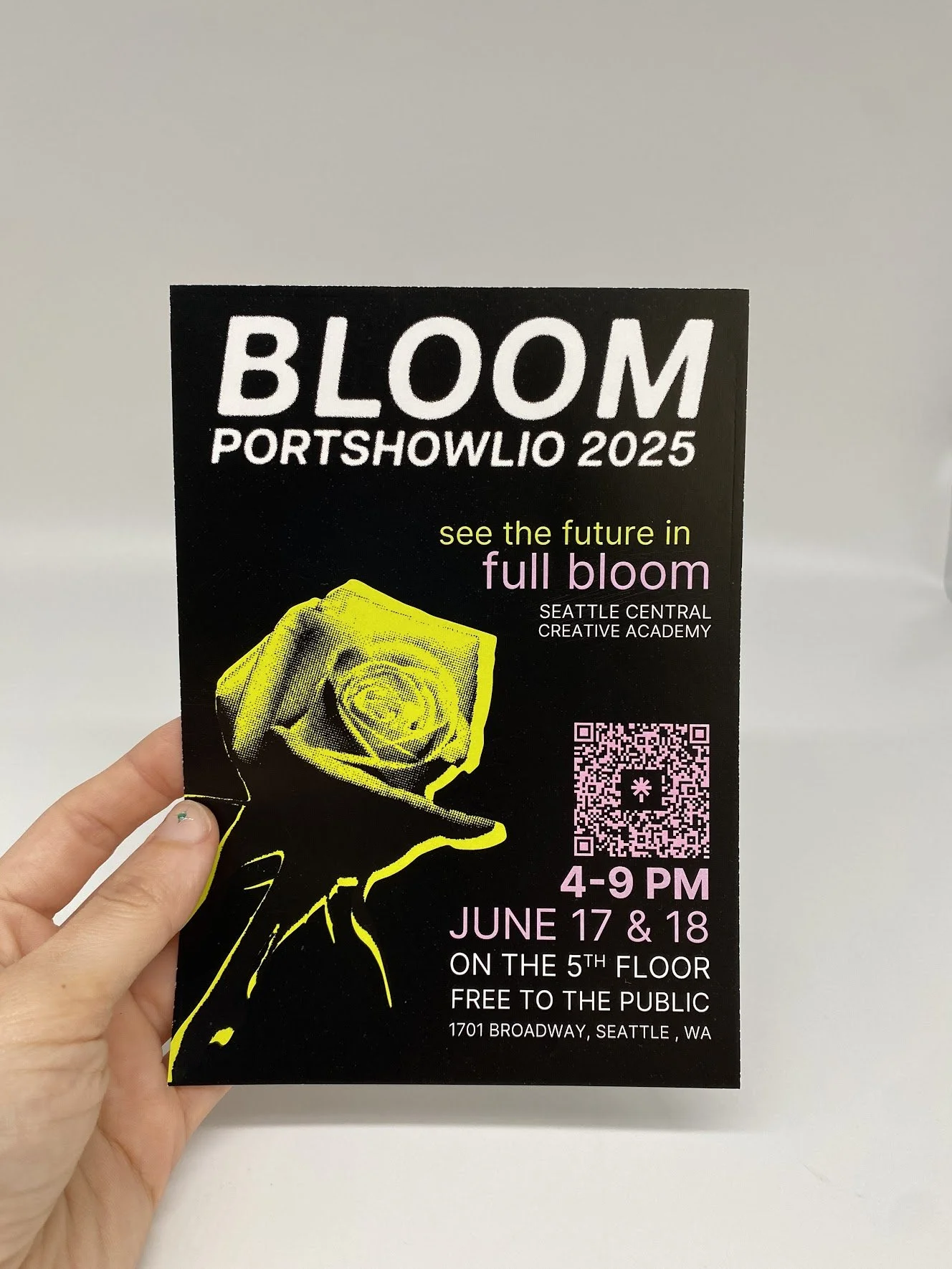
Bloom Event Branding
Branding / Art Direction / Project Management
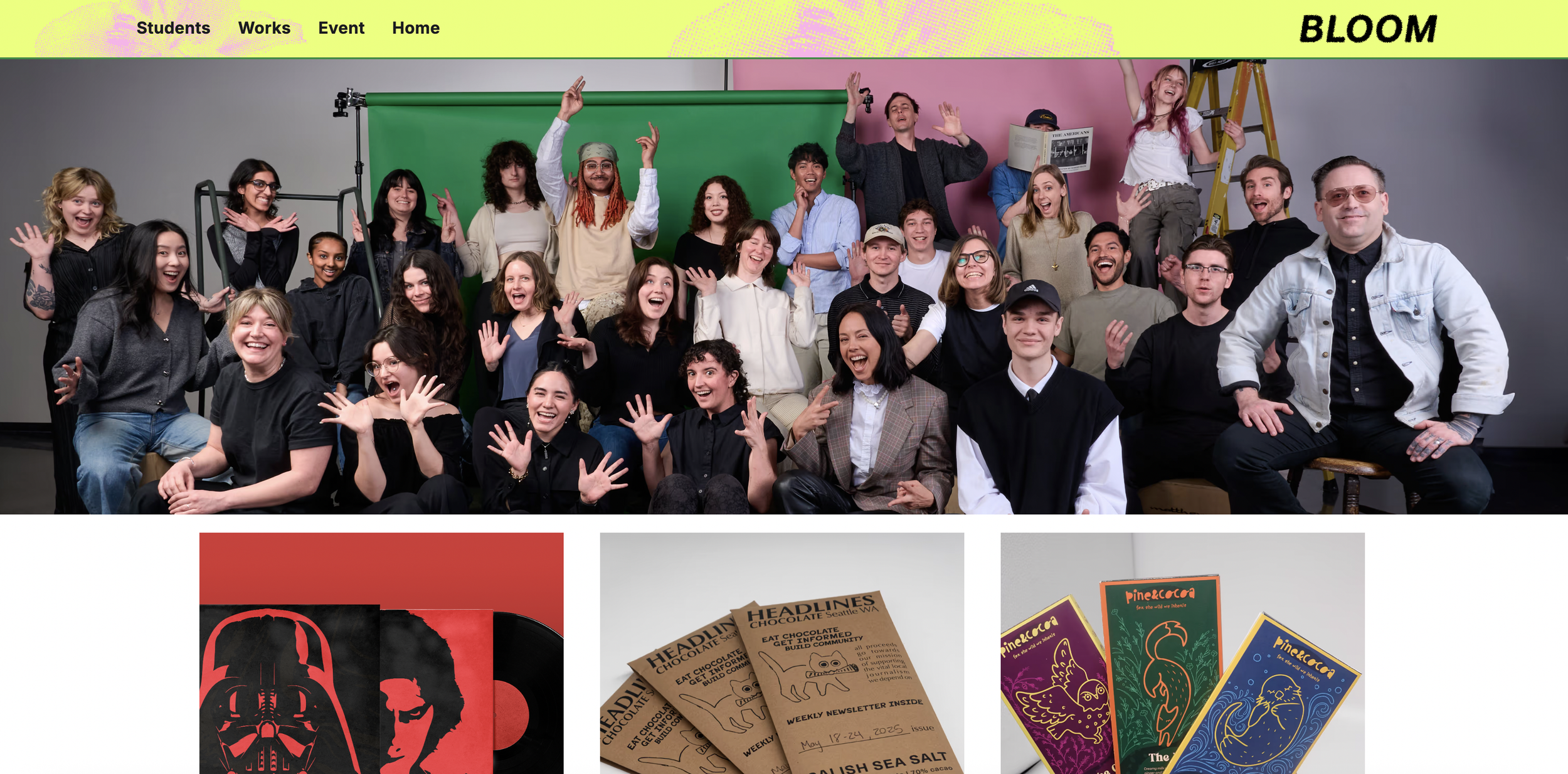
As leader of the branding team, I worked with a group of five collaborators to create a visual identity system for our graduation portfolio show. We created brand guidelines and implemented them in print, web, and social layouts.
-
Collaborators: Eleanor Howe, Shinyu Lee, Timneet Mamu, Emily Taylor, David White
Timeline: 12 weeks
Tools: InDesign, Photoshop, Illustrator, Figma, Large Format Printing
-
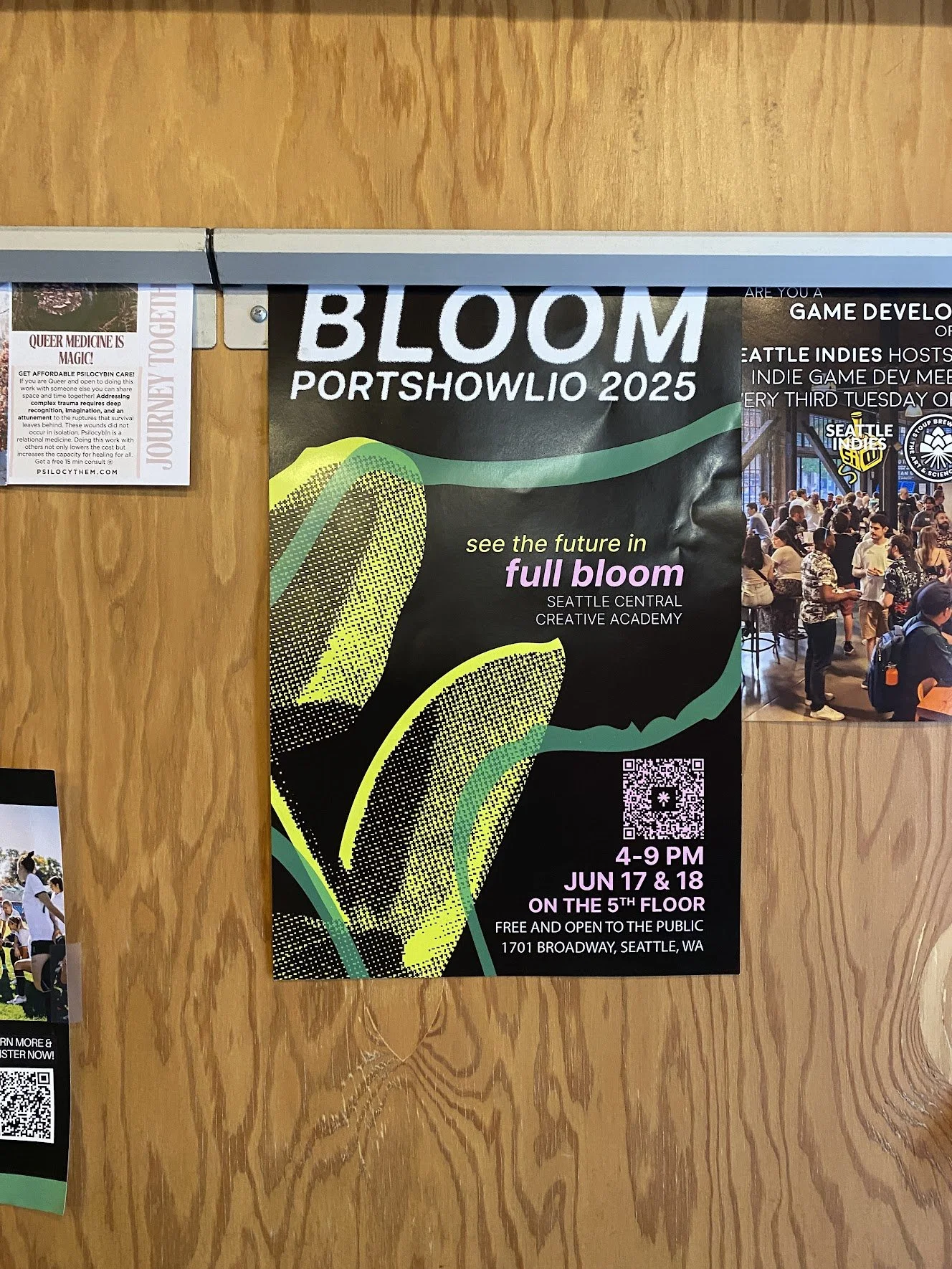
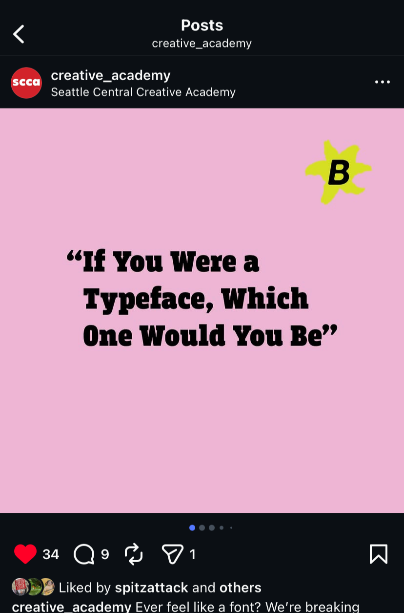
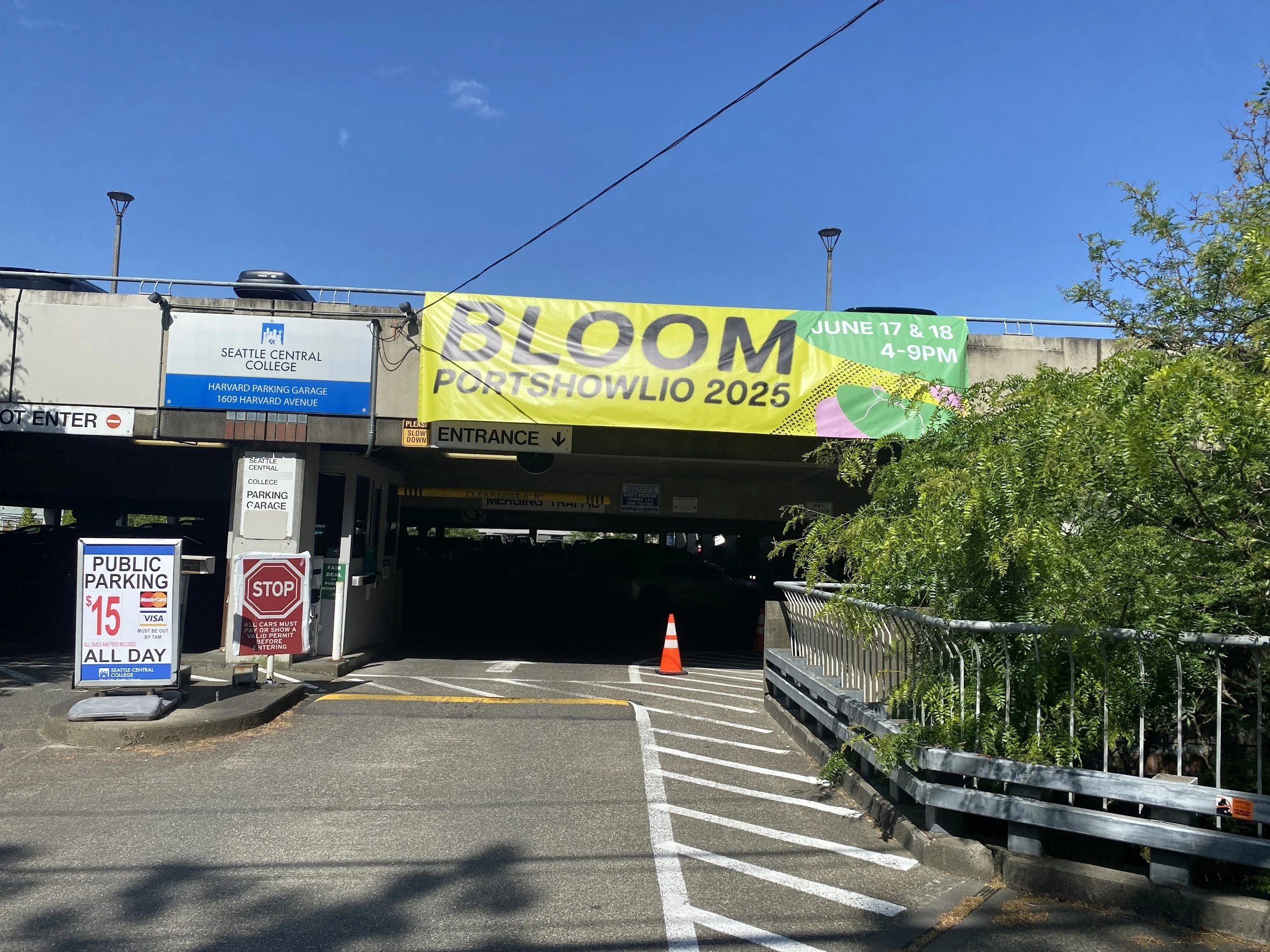
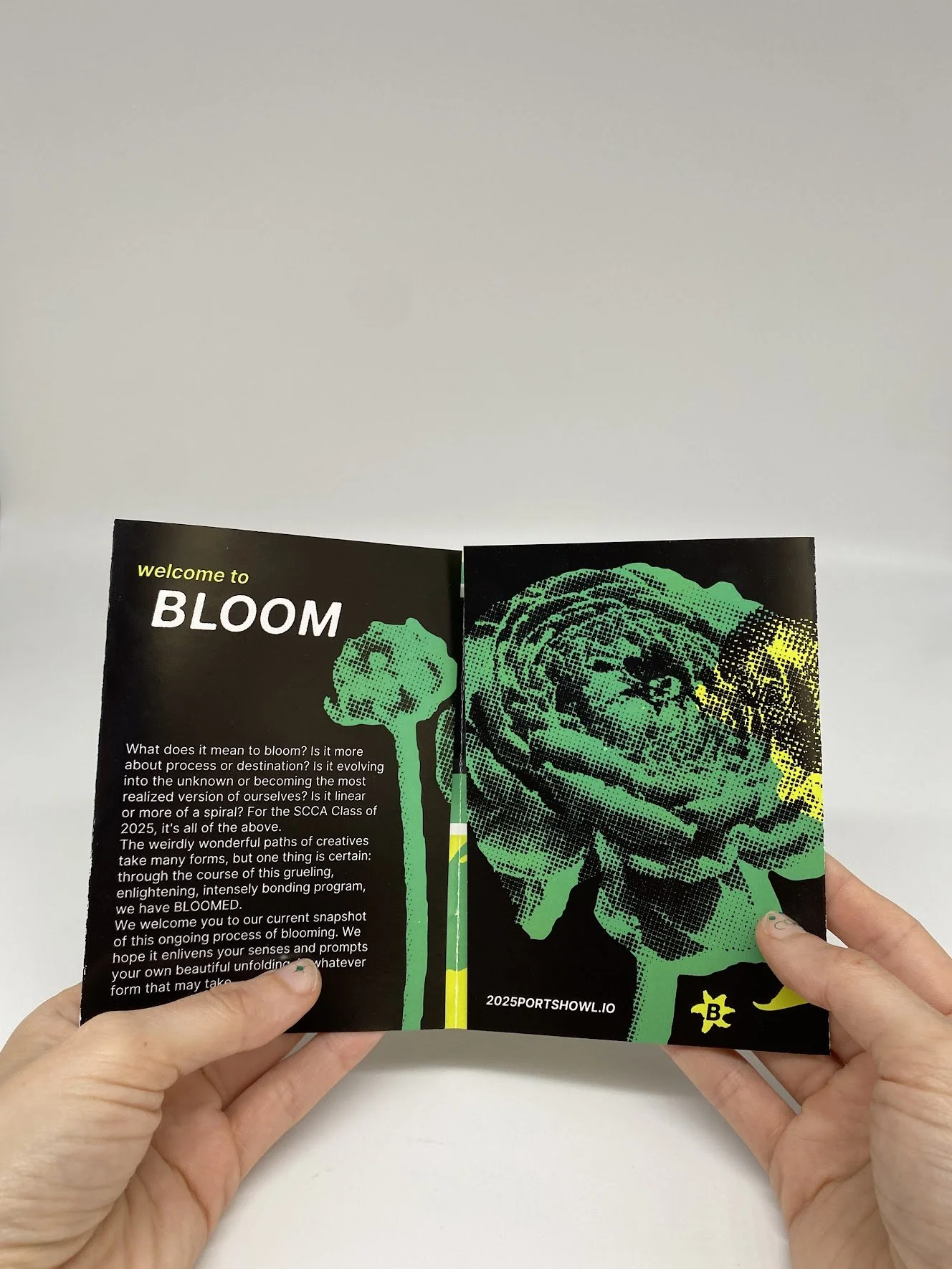
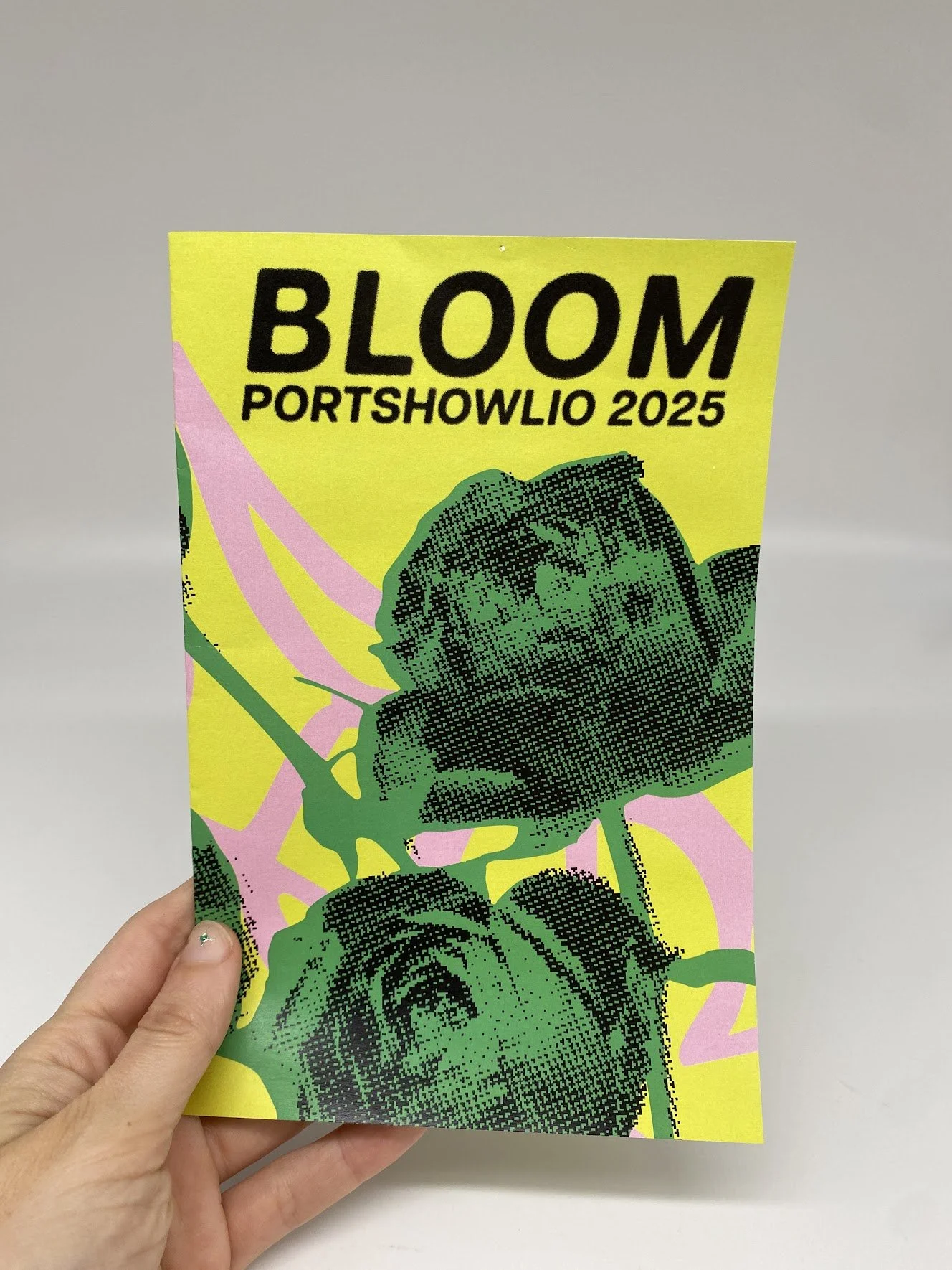
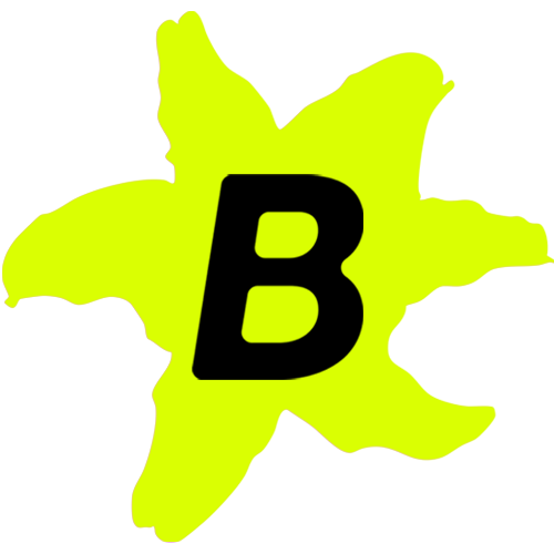
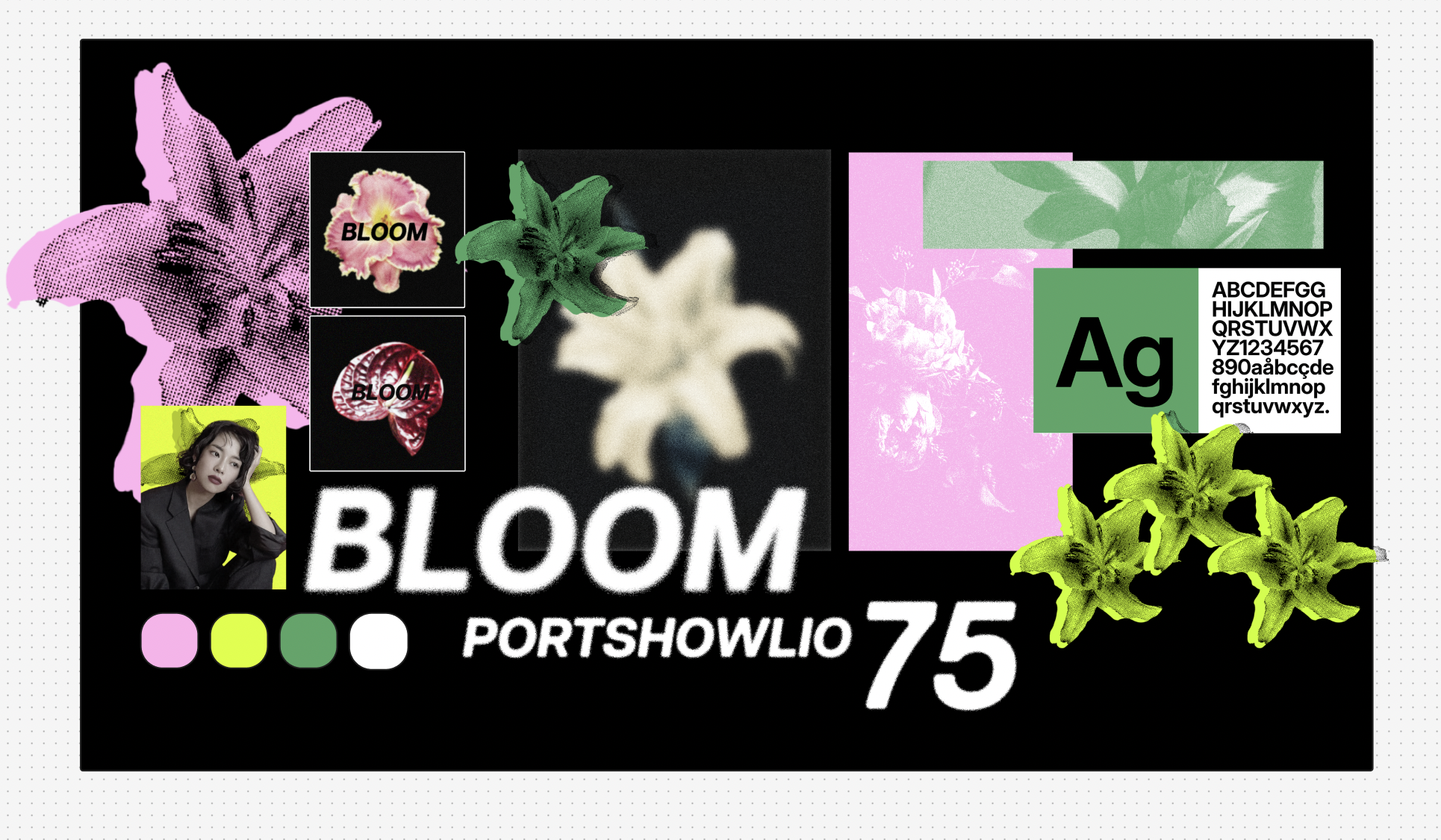
The concept for the show, Bloom, was chosen by our class of 35 students. Our job as the branding team was to figure out how we could visually express the concept of Blooming as a metaphor for our time at design school while avoiding common visual tropes associated with flowers.
-
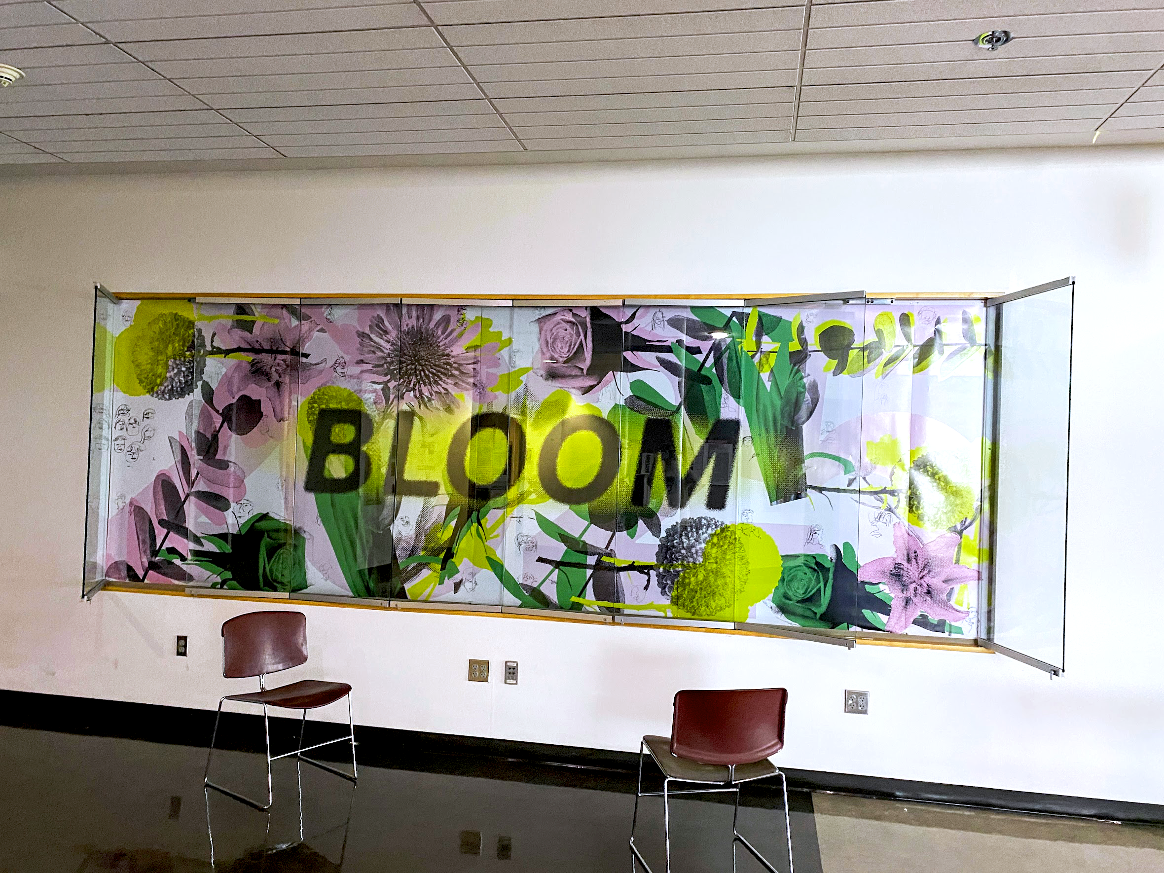
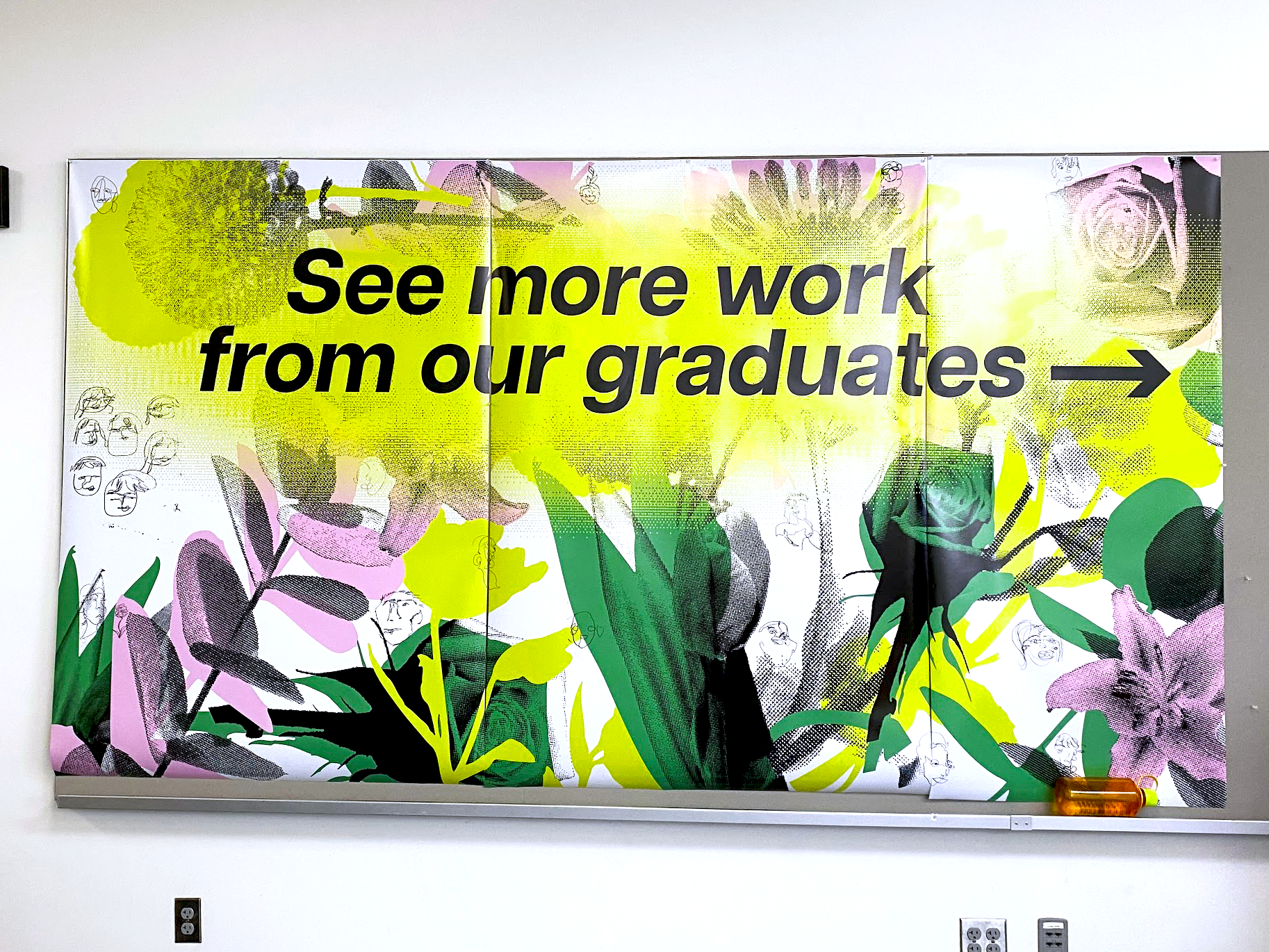
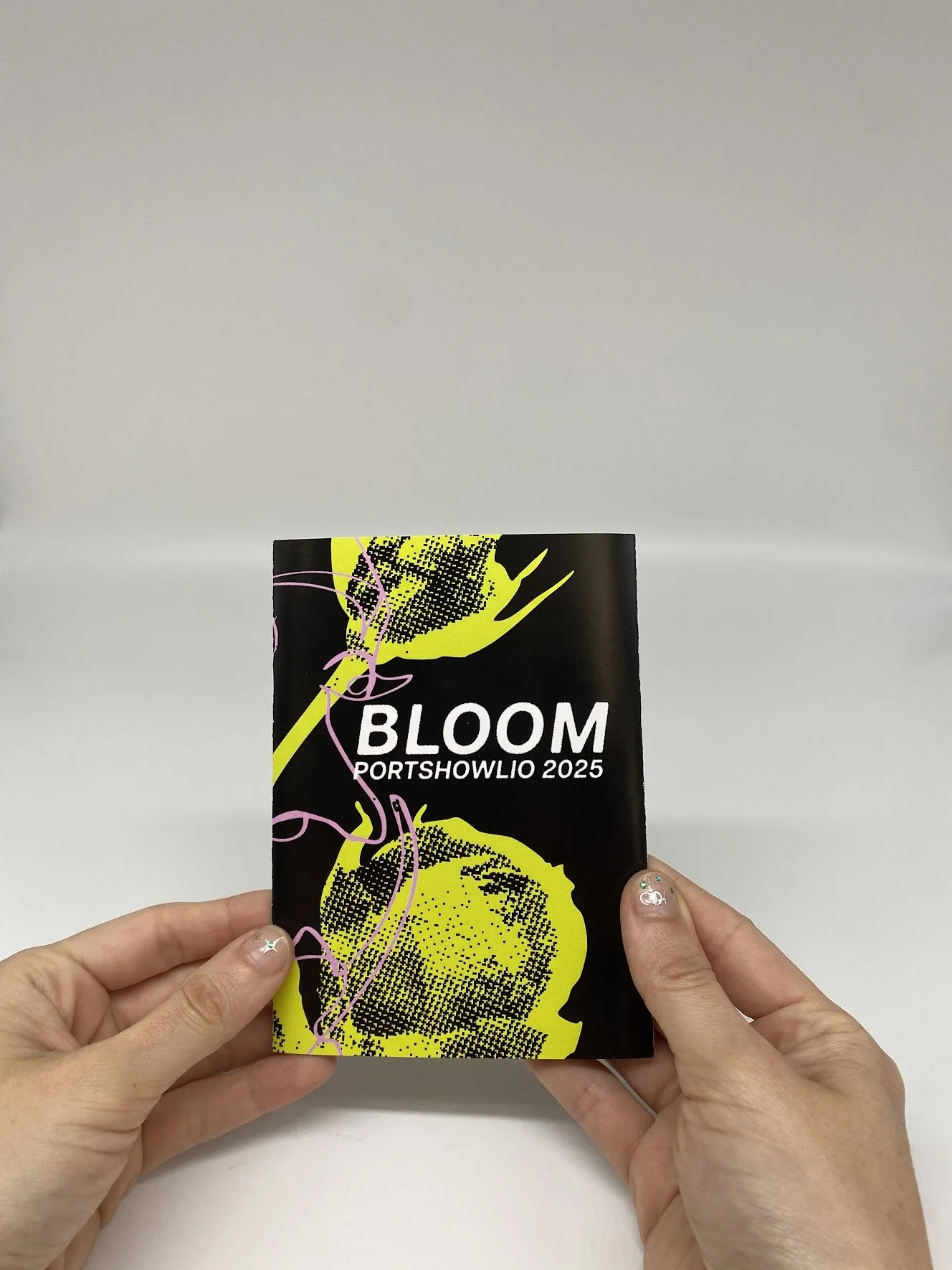
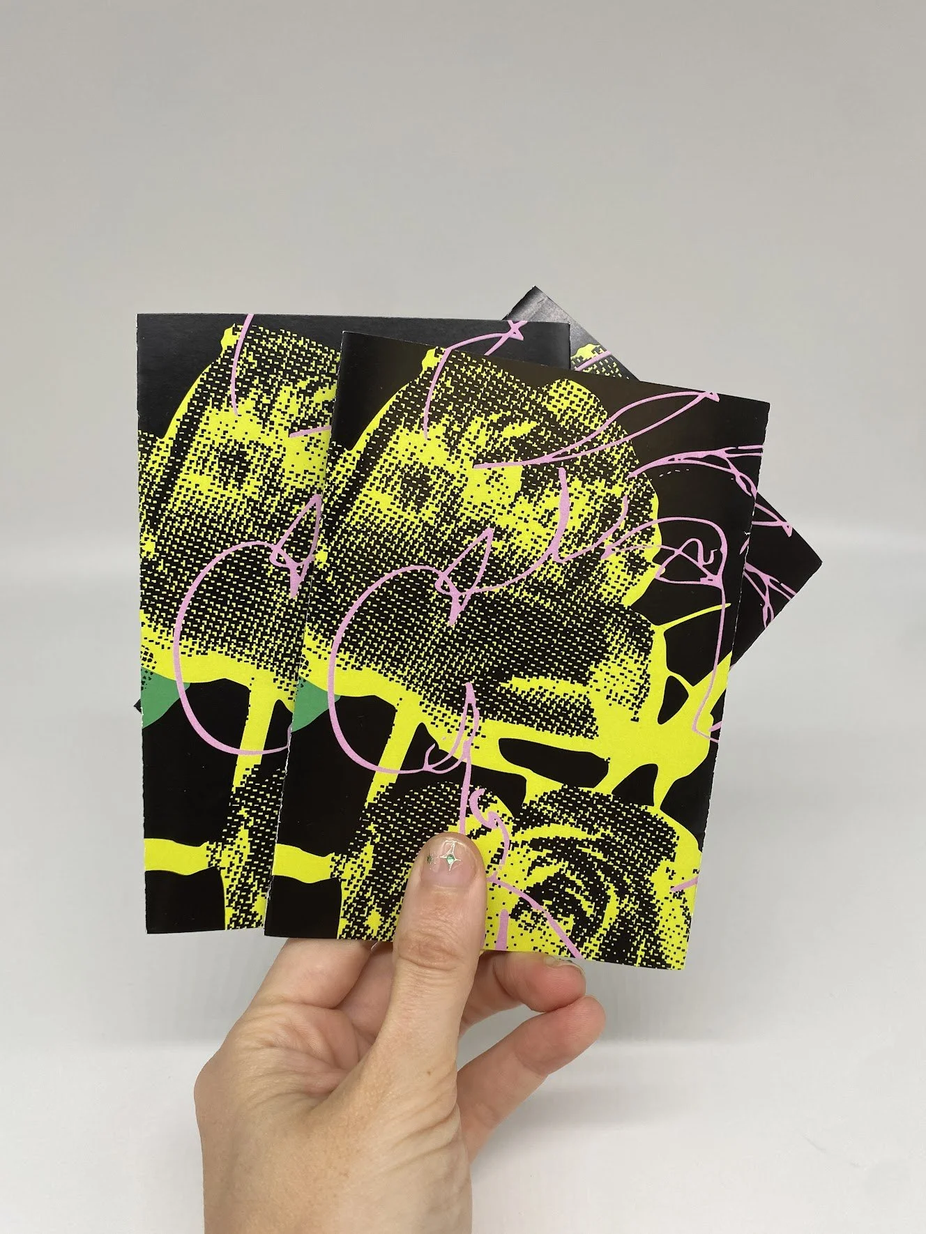
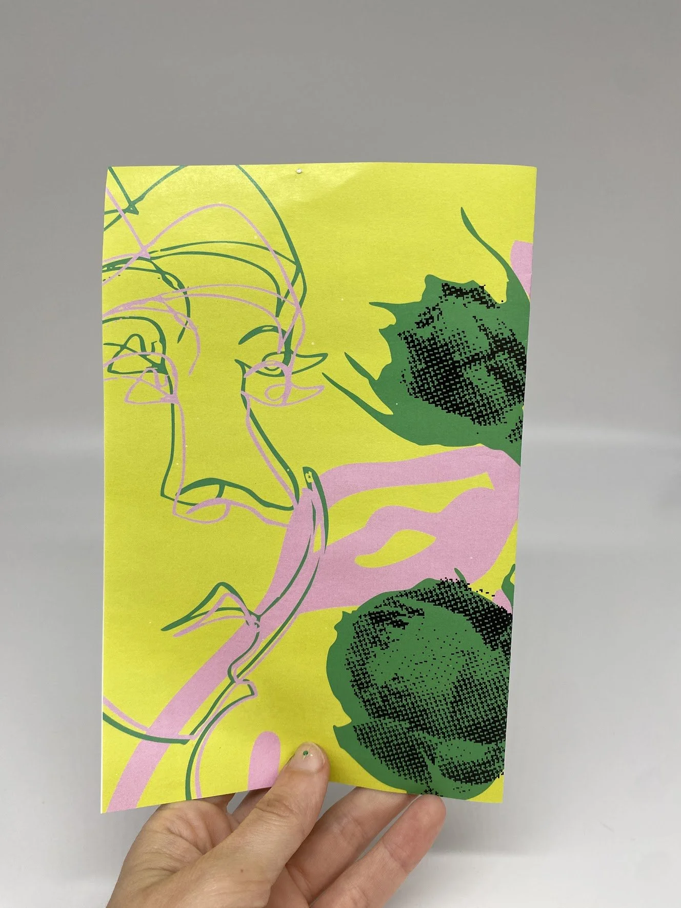
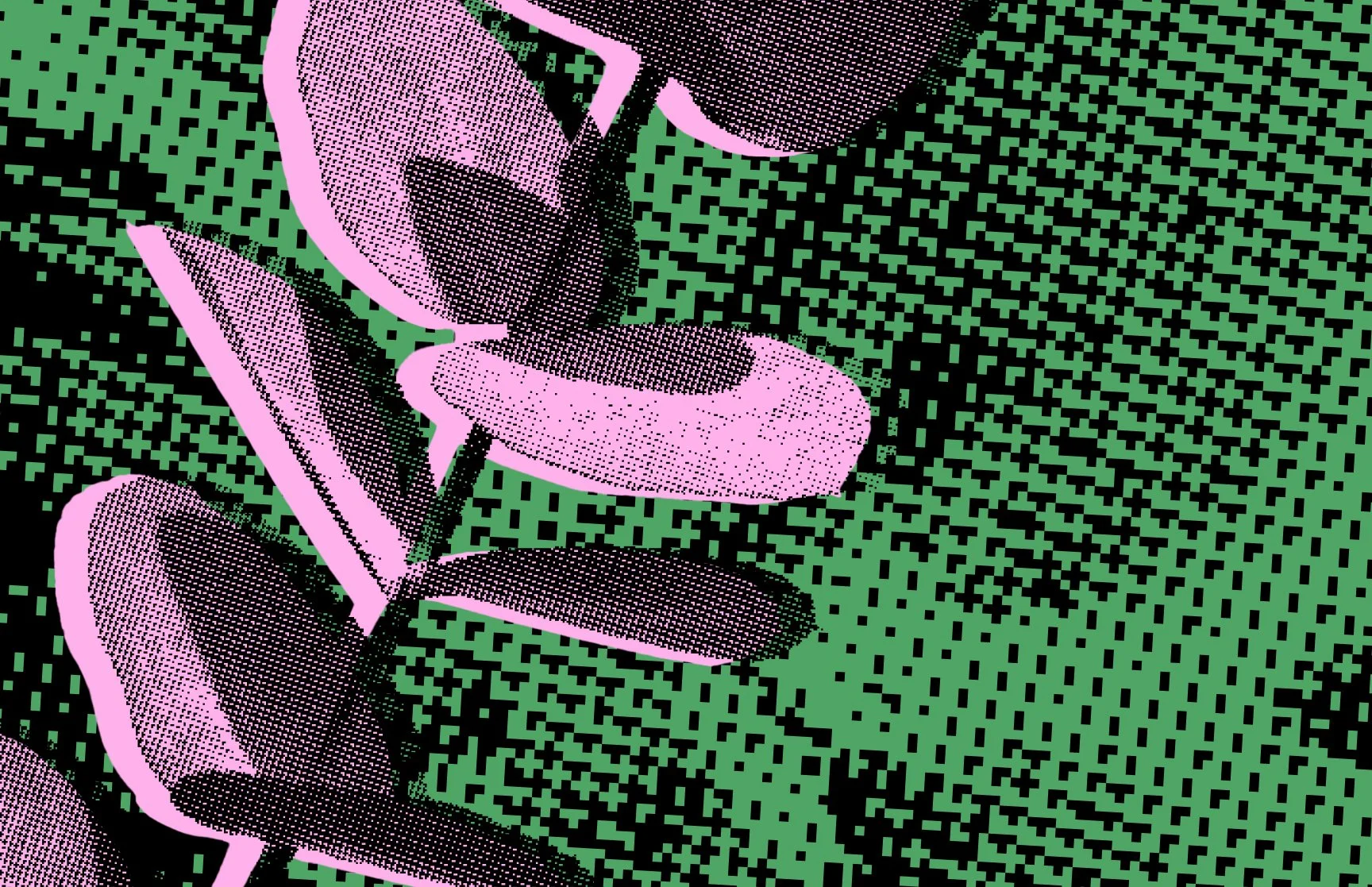
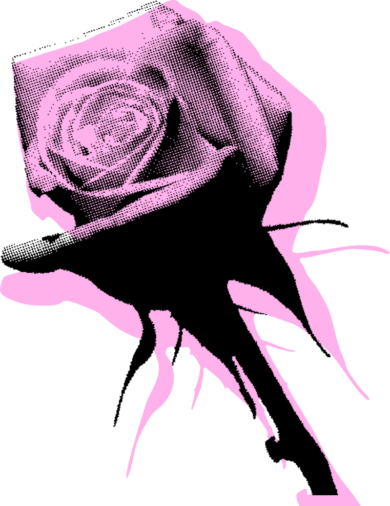
Our design system uses the organic shapes of flowers as containers for an inorganic bitmap texture. Sinuous lines evoke the softness of flower petals and are meaningfully derived from blind contour drawings of and by our classmates. Our bright color palette of neon yellow and green with pink accents is both natural and artificial, reflecting our natural growth as designers and photographers in a digital world.
Our team used Figjam to ideate & define the core elements of our brand
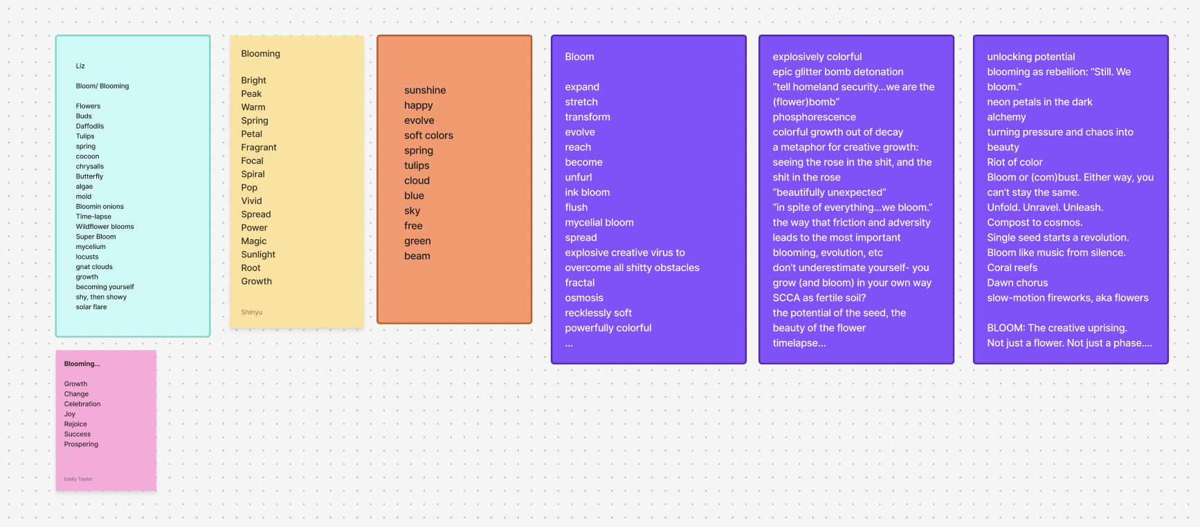
We started with a brainstorm and free association on the word bloom
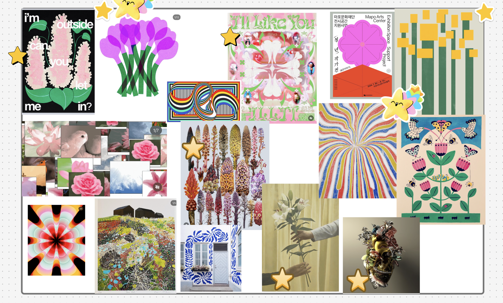
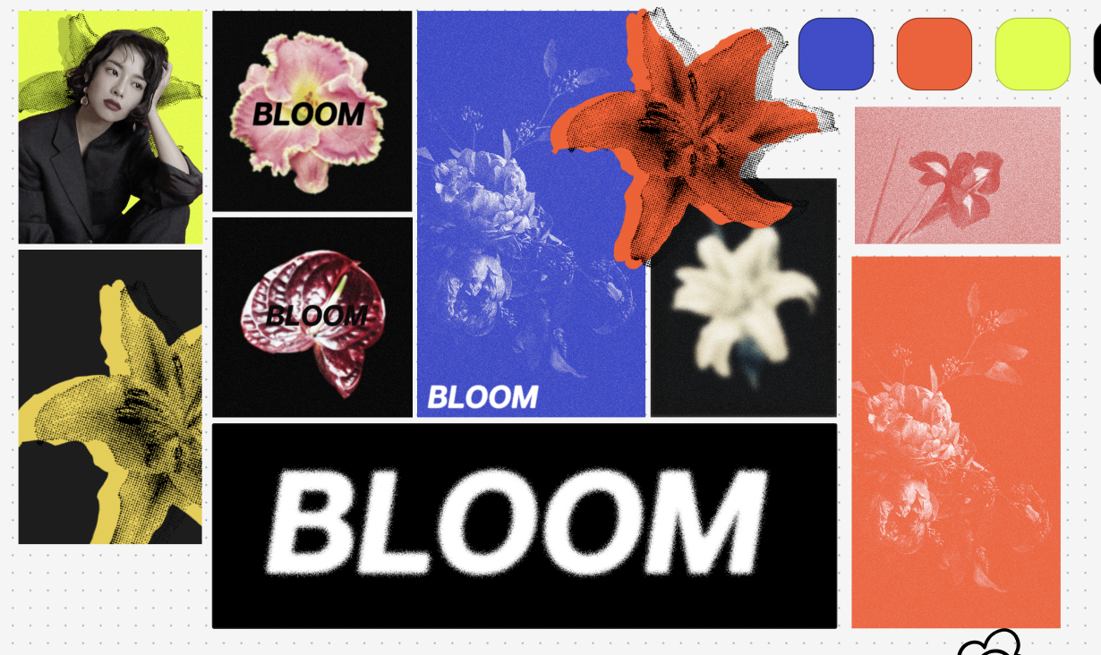
Each team member made a mood board based on what we brainstormed
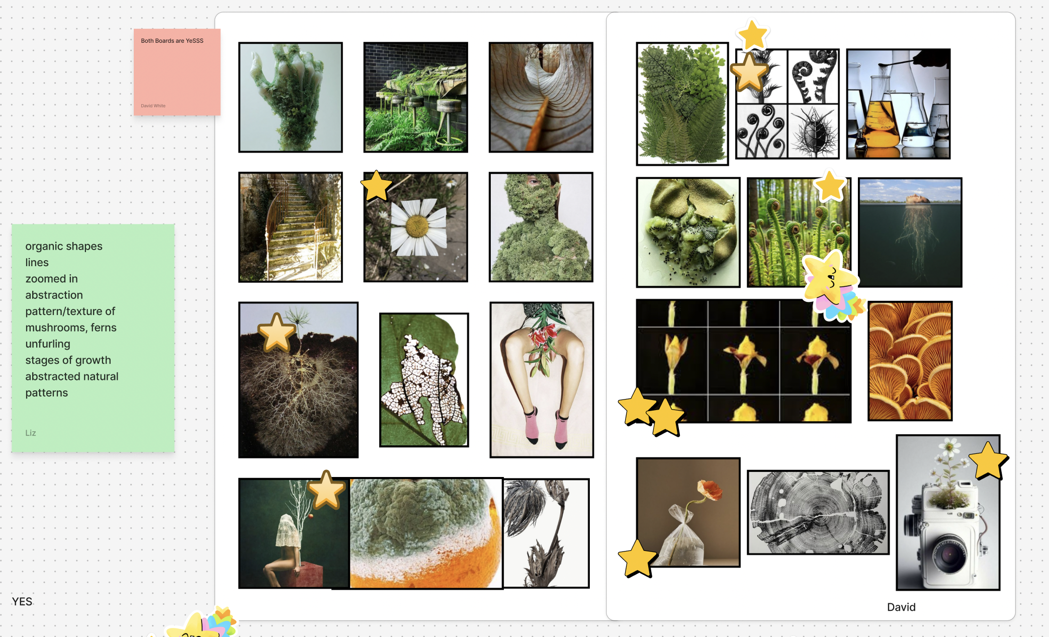
We made notes on what stood out from each
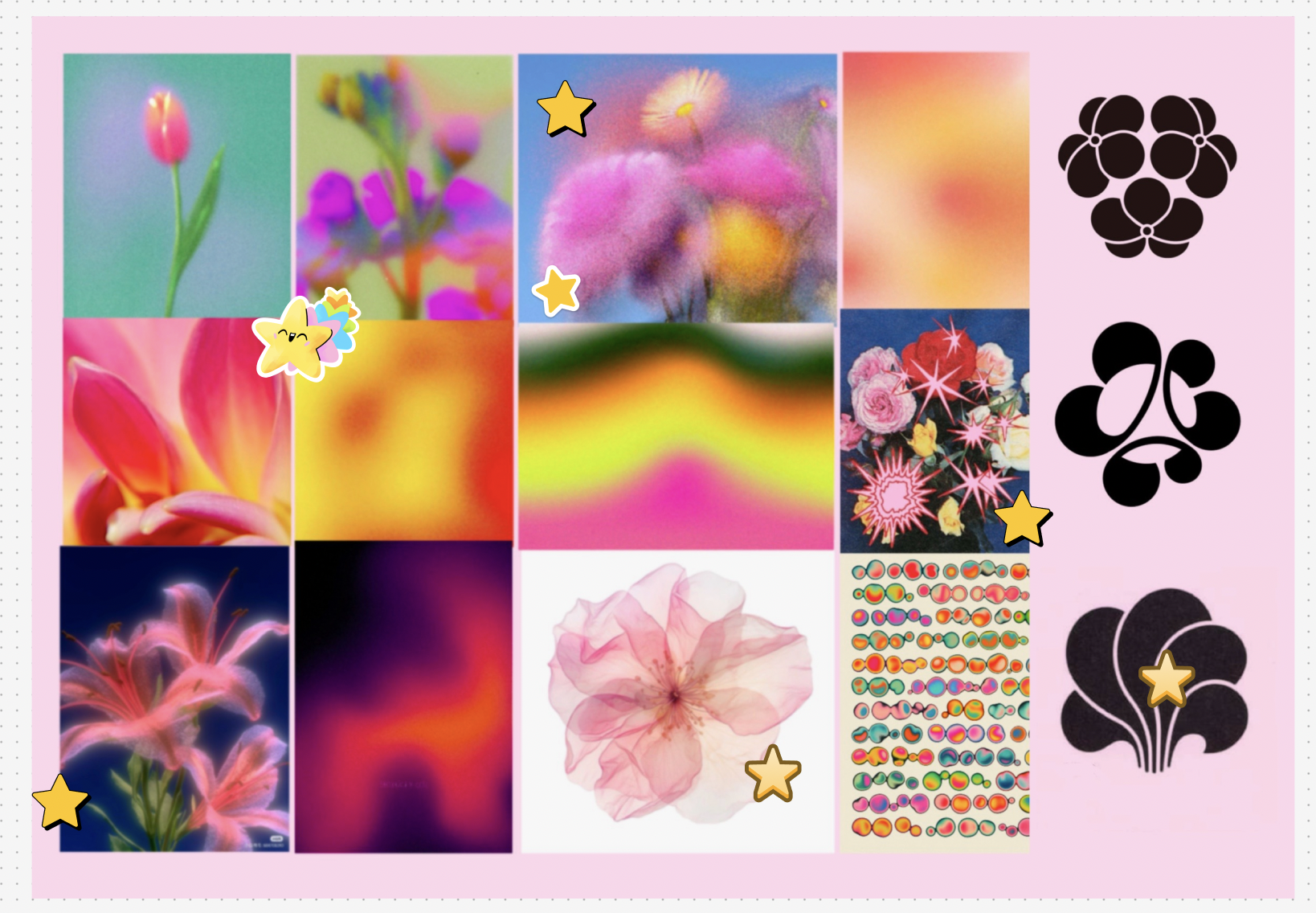
Teammates starred things that stood out
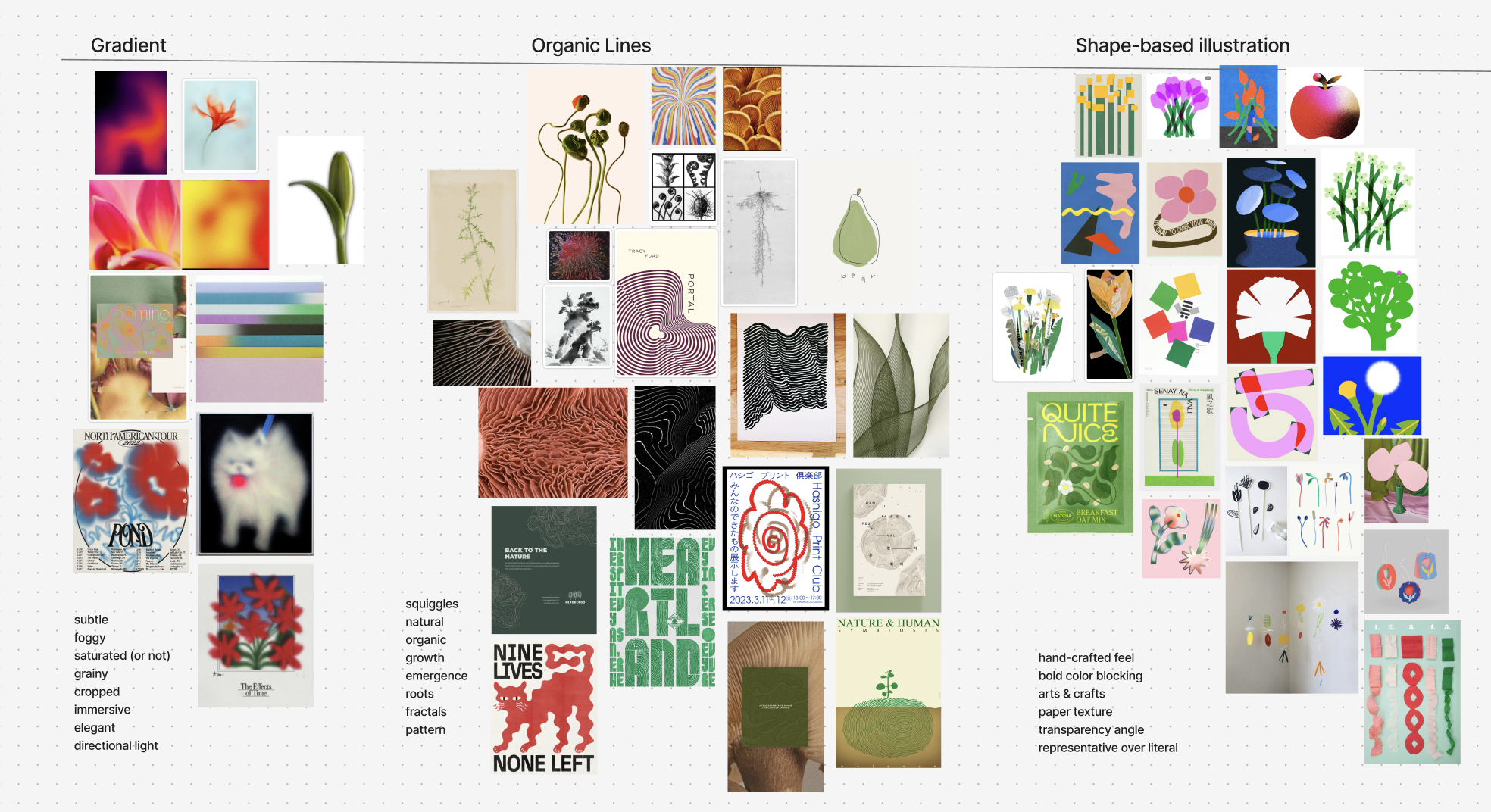
Three core design elements emerged: gradient, organic line, and shape-based illustration
With our core elements identified, we refined our concept and created brand guidelines
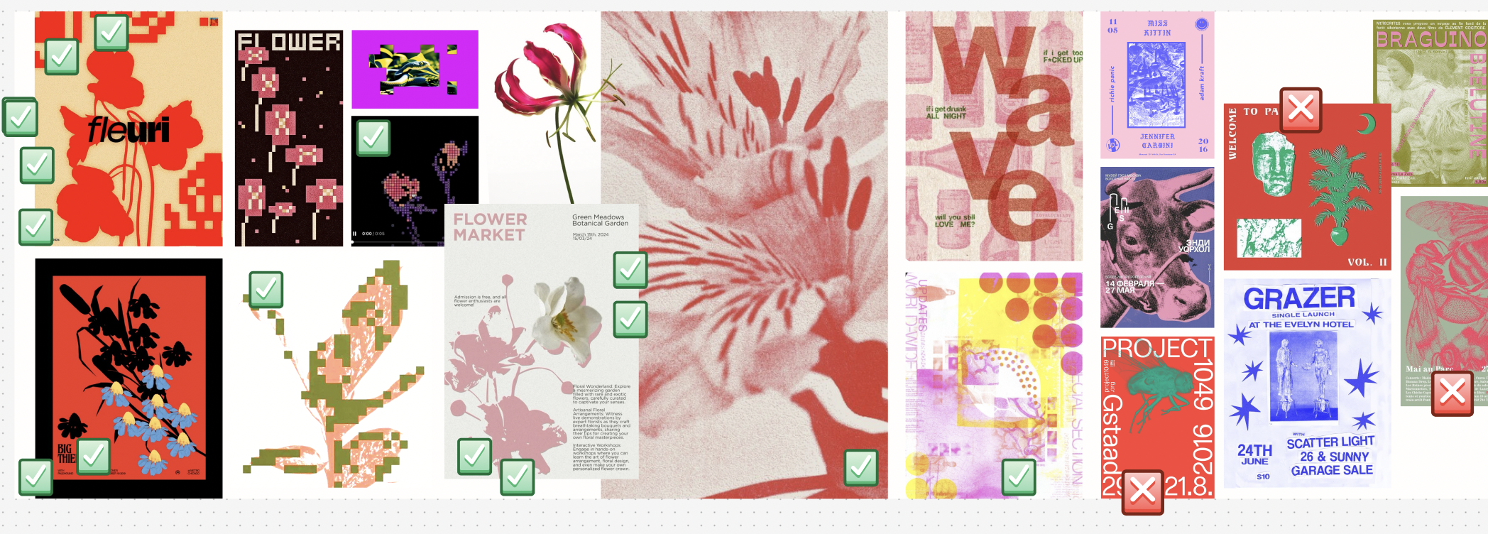
We combined what was working into a new mood board
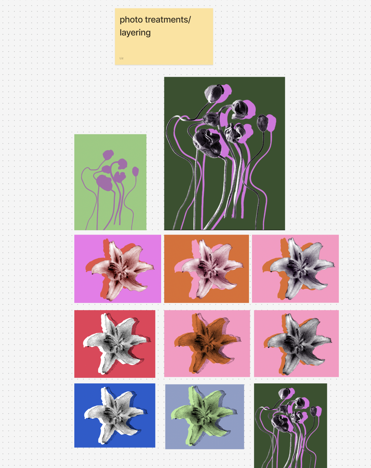
We experimented with how to create the pixelated texture we were drawn to
We created a first draft of our concept board
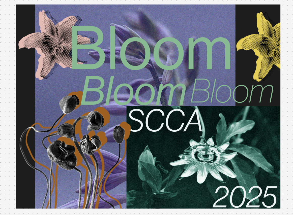
And refined it with more dynamic colors
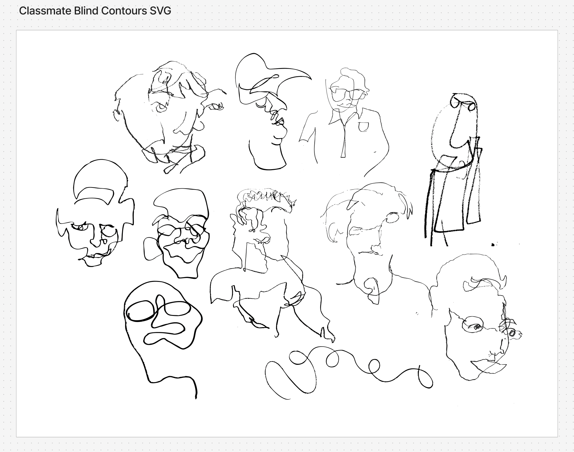
We realized we were missing organic line, so we asked our classmates to make blind contour drawings of each other and turned them into SVGs
We pivoted to a punchier, pink neon and green pallete set against black
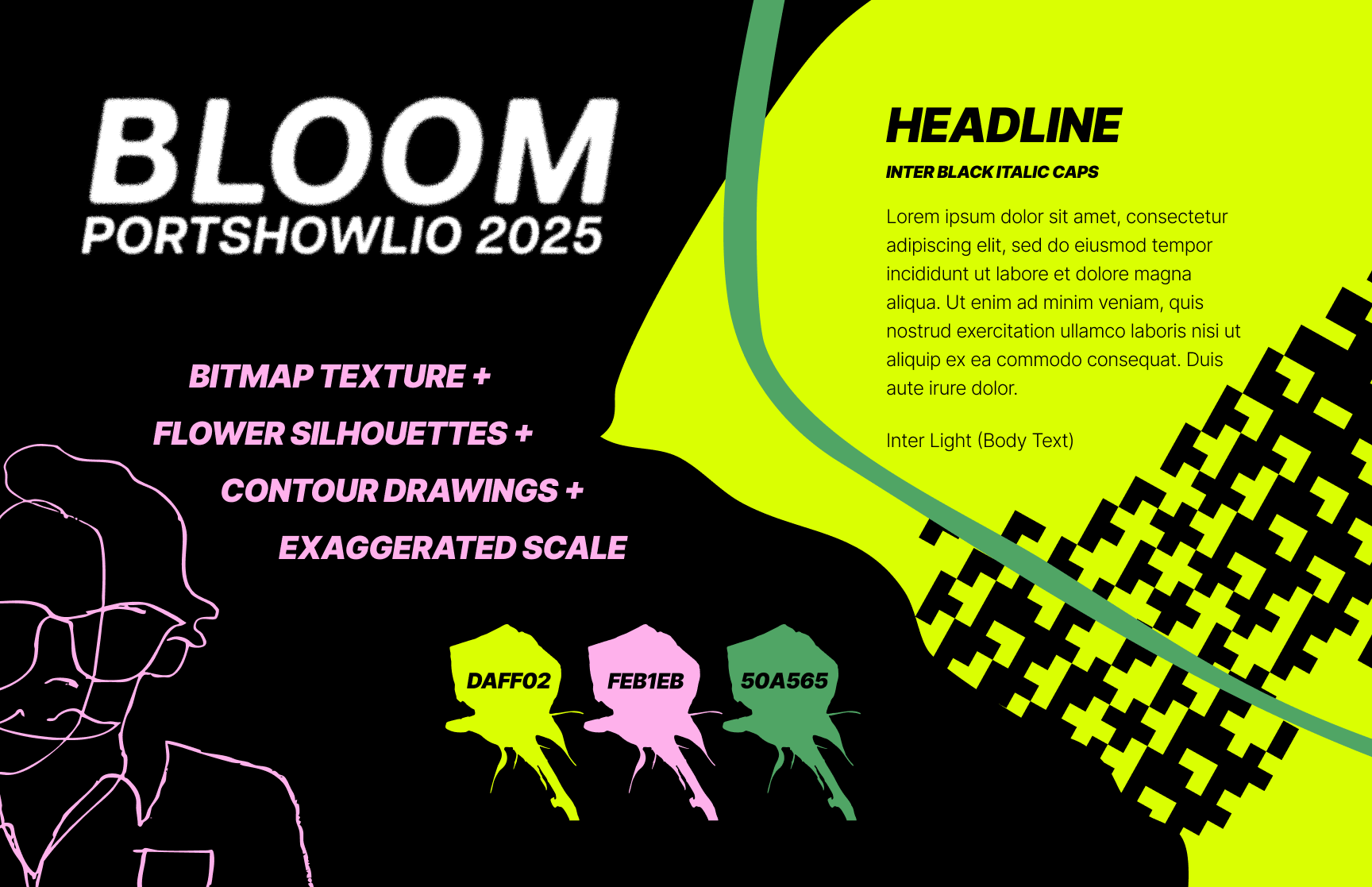
And created this final concept board
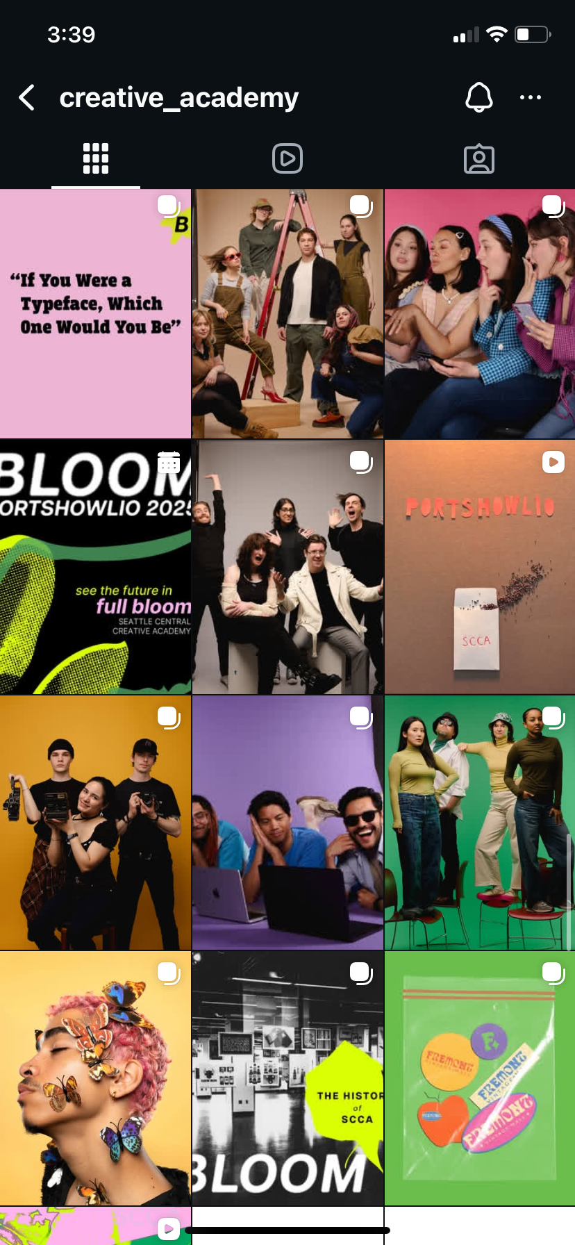
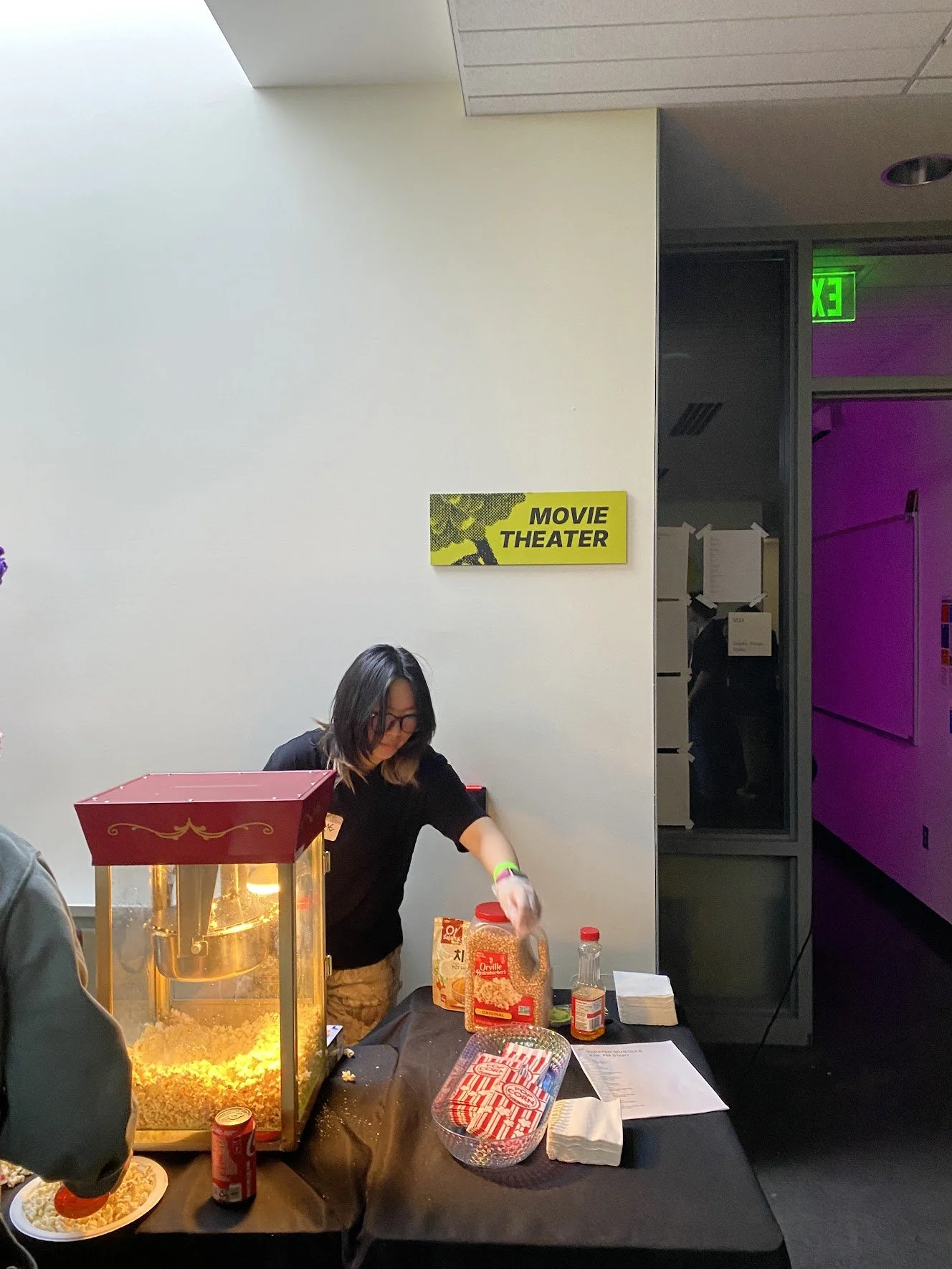
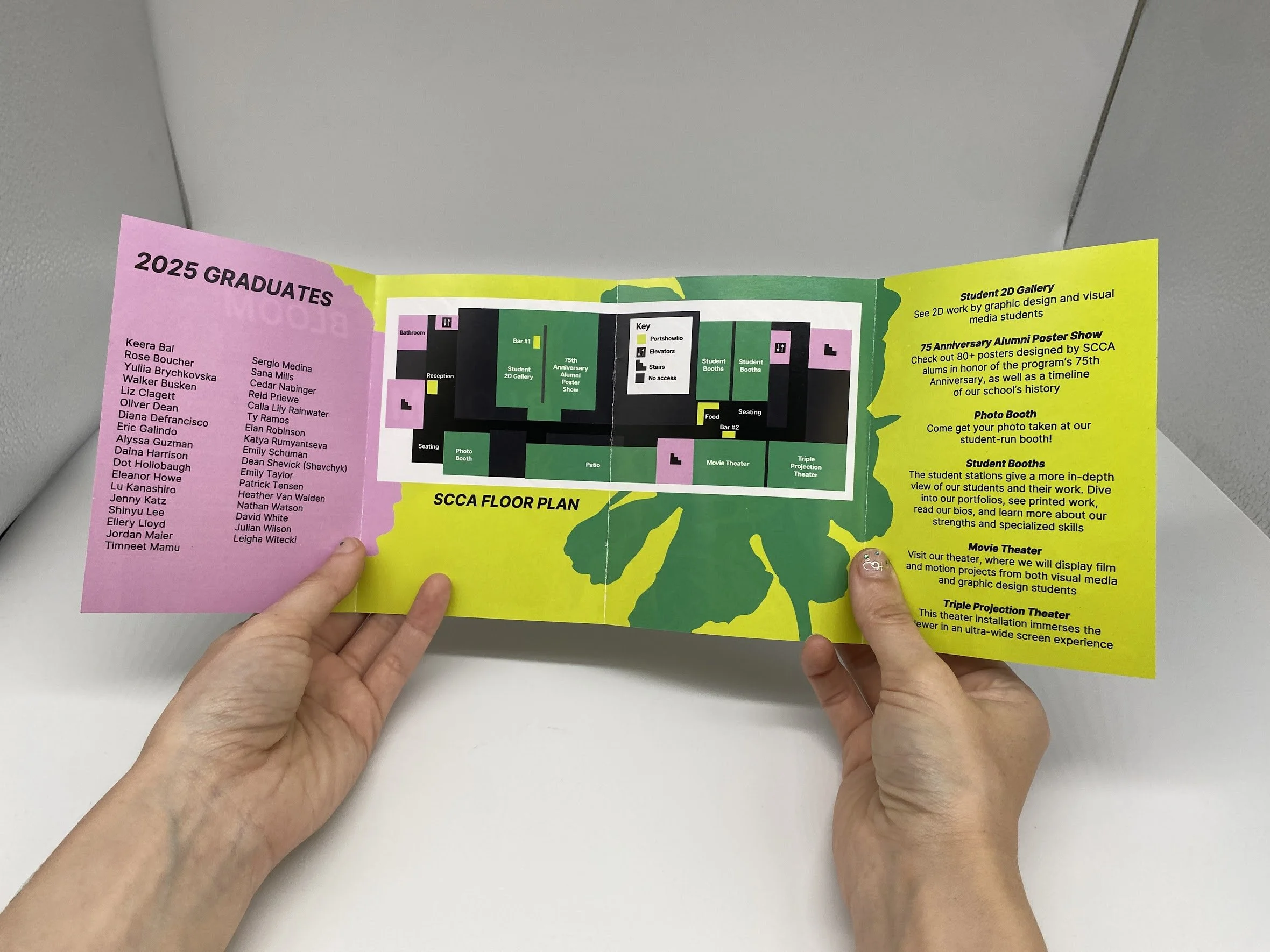
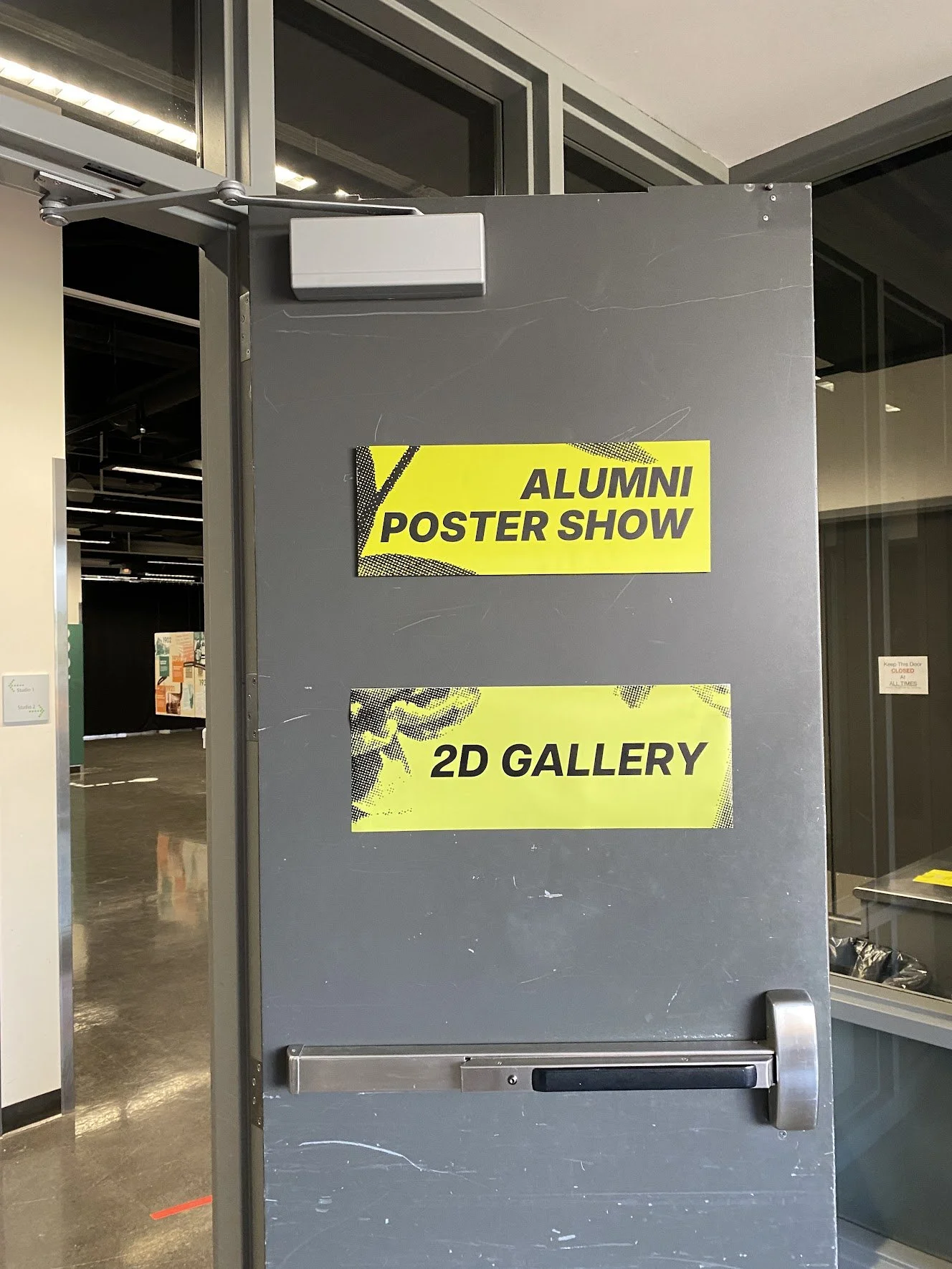
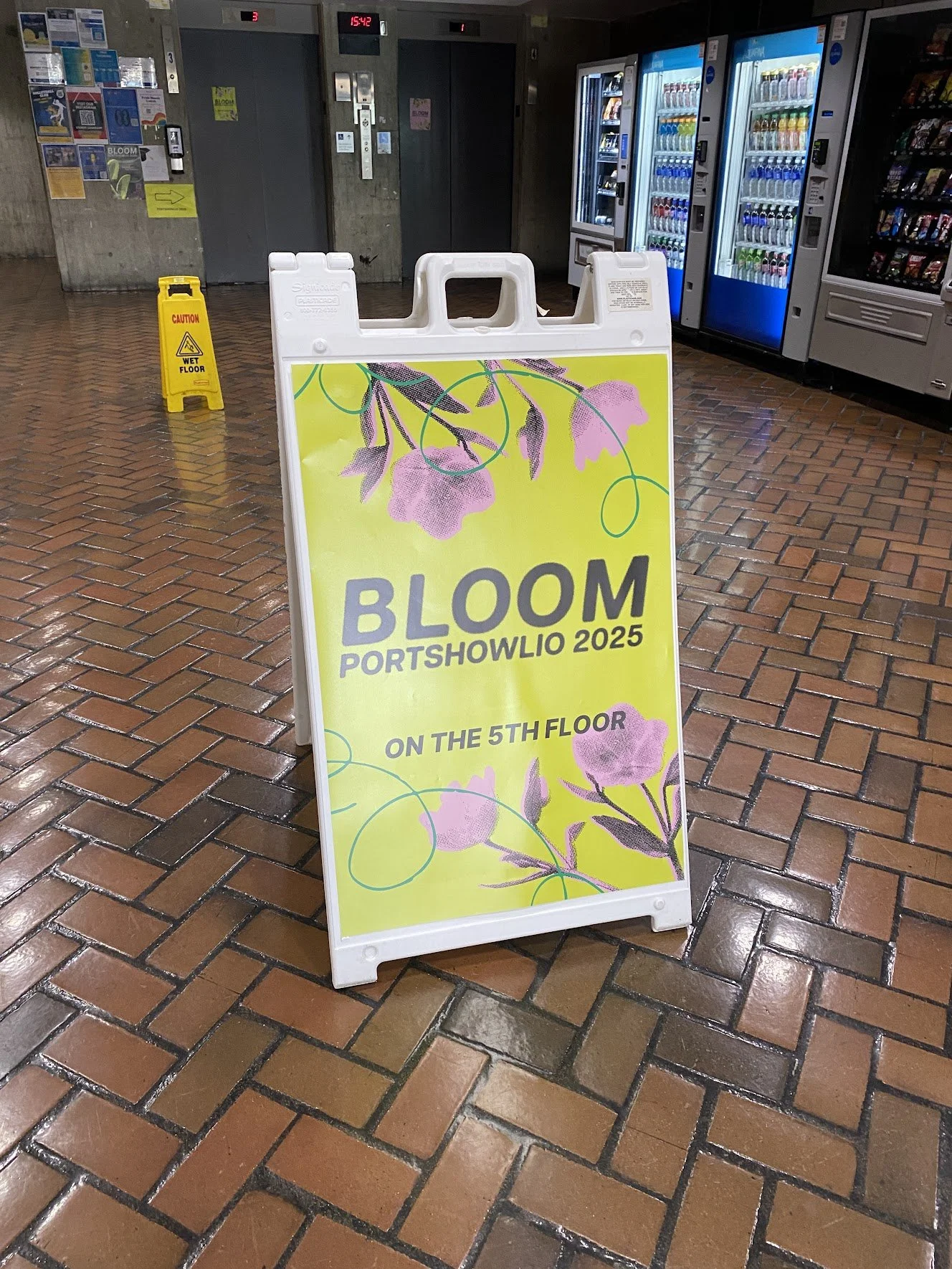
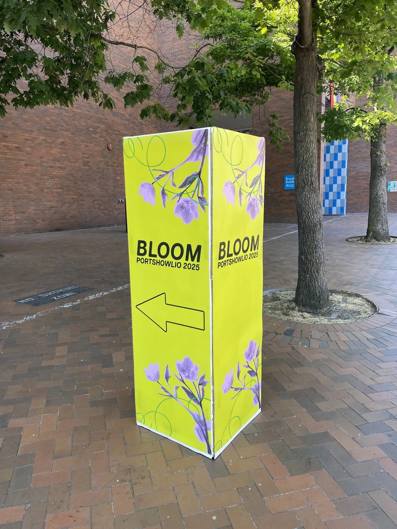
We sent our brand guidelines to the other teams who helped create wayfinding, social media, a website, and interactive exhibits